Curb Appeal

Let The Architecture Speak
The prior owners of this nearly original Streng Transitional model home had done a nice job preparing it and making it as turnkey as possible for the housing market. However, as a designer and longtime lover of mid-century design, I couldn't wait to implement my own aesthetic and really let the beauty of the architecture shine.
The Palette
Getting Your Basics Down
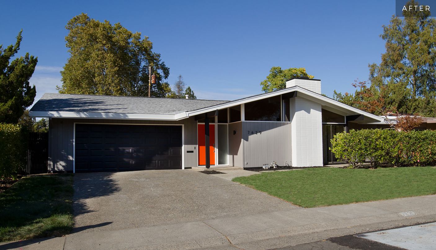
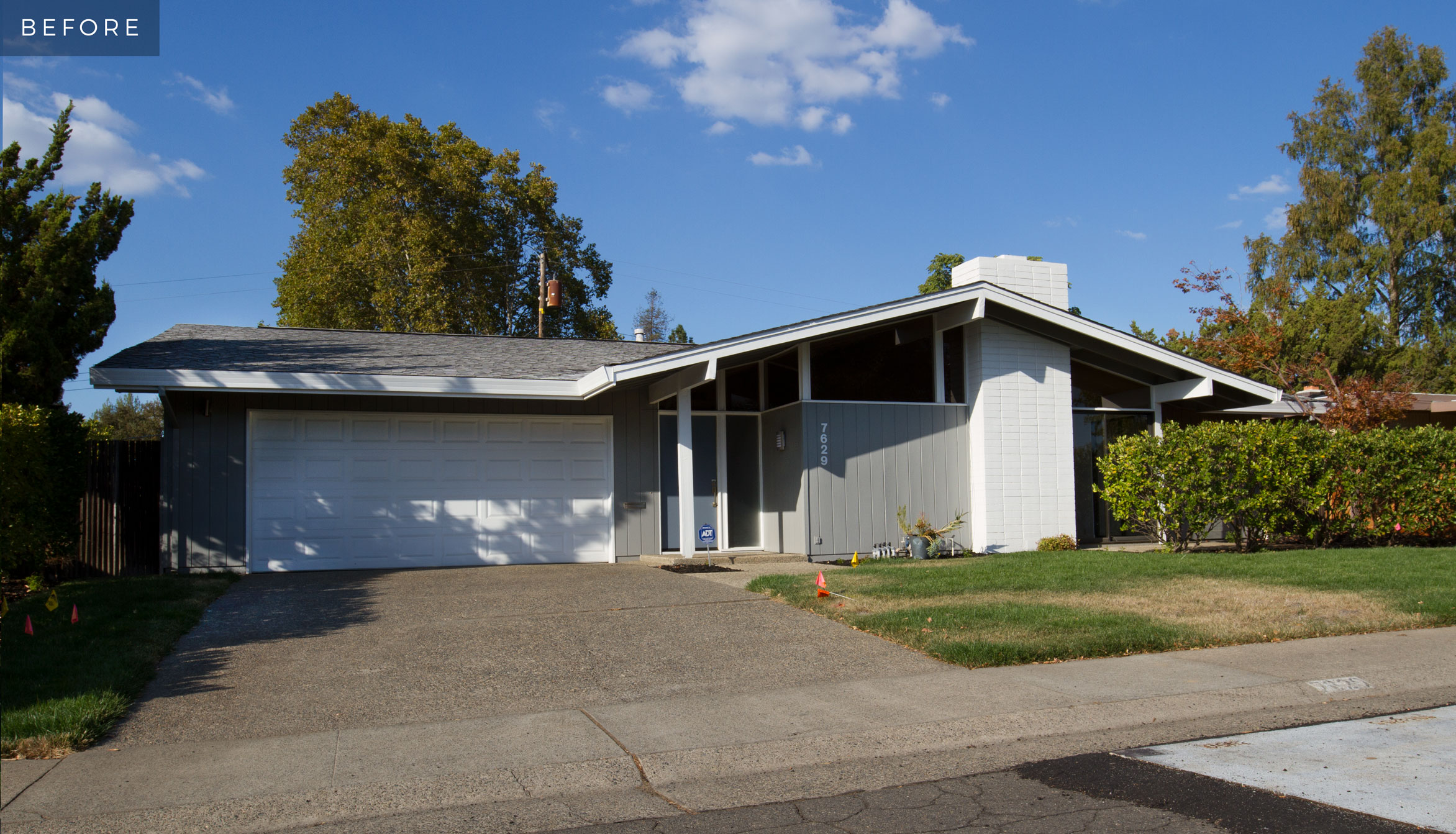
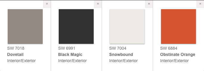
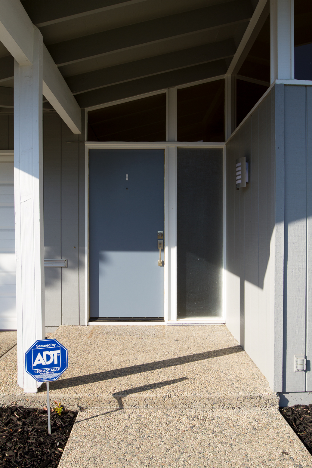
When I bought the house, the exterior color scheme was similar to my own plans - gray and white. However, the gray was too cool and had a hint of purple in it, while the white was also too flat and cold for my liking. So, I headed to Sherwin Williams and picked up Dovetail in satin finish for the exterior gray. It has a similar tone to the existing color but has a touch of red in it, giving it a much warmer hue. Similarly, the white I chose, Snowbound in gloss, has just a hint of warmth to it giving it more of a brilliant cream color.
The eaves of the house were painted gray and it made the house feel heavy overhead, so I painted those Snowbound to give a sense of lift.
Adding The Drama
It's easy to go overboard with drama, so less is always more in my book. Certain elements of the architecture of any building can be accentuated, exaggerated, or highlighted simply by using color strategically.
BLACK FOR WEIGHT AND LINES
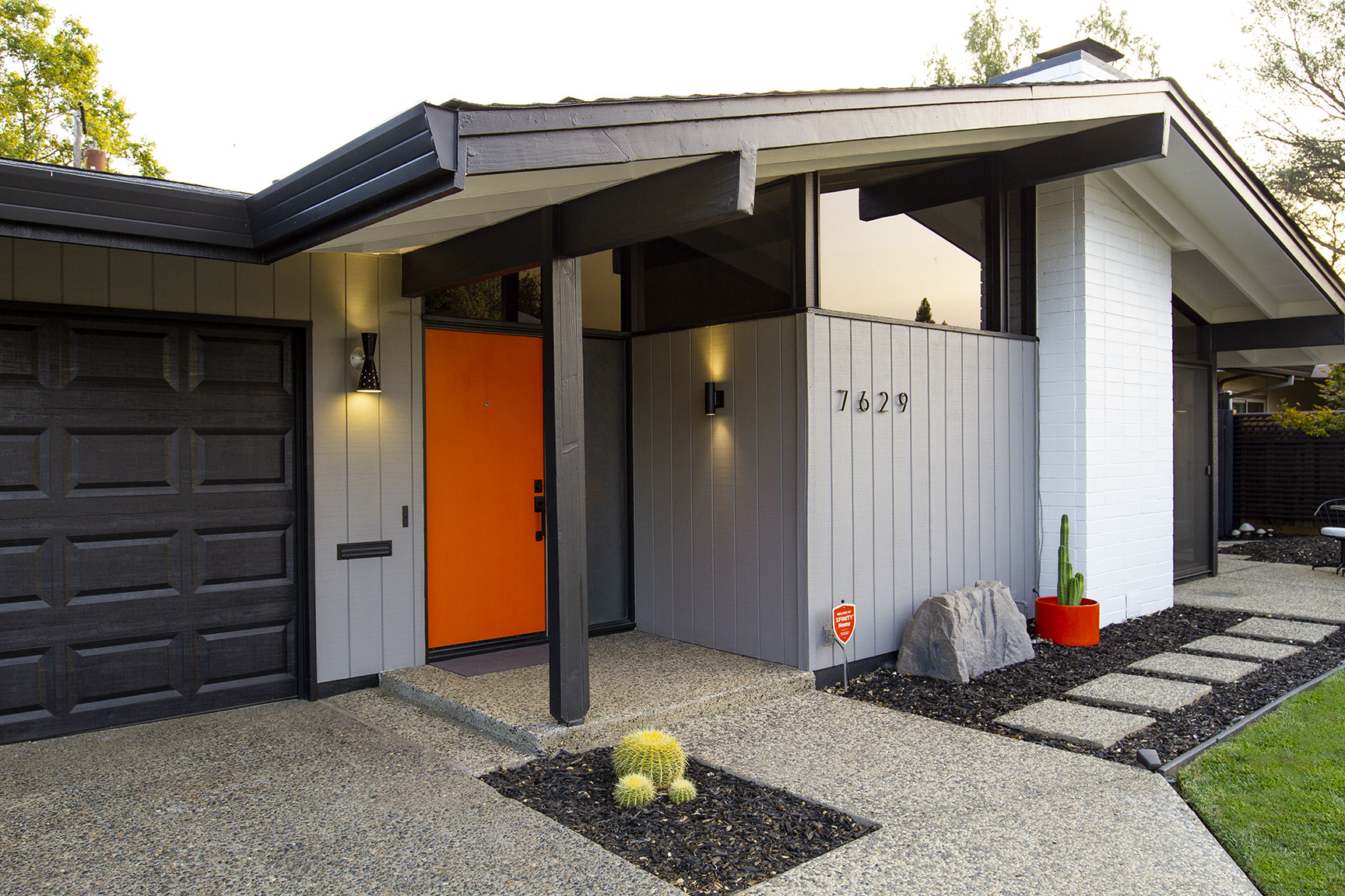
For example, I wanted to bring black accents (Black Magic) into the gray and white color palette. Mid-century architecture had a strong emphasis on showcasing the functional structure of the buildings with those structural elements remaining visible wherever possible. For my home, the posts and beams are out for everyone to see, so the black really helps to define those elements and gives crisp, clean lines to the overall presentation. During the day, the big windows near the fireplace appear black due to their reflection in the shade of the eaves. So, to balance that weight on the left side of the house, I painted the garage door black. Don't be afraid to go dark sometimes. In this case, having such a huge block of white was just too bright and distracting from the rest of the home and a garage door is almost never a highlight to any home. More importantly though, the garage door is no longer competing with the brilliance of the fireplace, which is the main feature that draws your eye upward to notice the super cool clerestory windows.
USE COLOR BLOCKING And VISUAL BREAKS BOTH SPARINGLY AND STRATEGICALLY FOR MAXIMUM VISUAL IMPACT
Another common theme in MCM architecture is the sense that elements of the structures are floating. Roofline, clerestory, and floor to ceiling windows give the impression of a floating roof, all of which are found in MCM structures and this home is no exception. So, when I noticed that the siding terminated above the foundation revealing the cement slab, I thought it was a good opportunity to accentuate this feeling of floating. So, I painted that slab black, which provides a visual break between the side of the house and the ground while at the same time giving the overall presentation more crisp, clean lines, which is the key to making any home look its best.
Lastly, I changed out the house numbers. The house came with chunky Helvetica numerals, but I got a thin Neutra-esque set of numbers instead, which were about $7 a piece at Home Depot. These originally came in brushed aluminum, but a quick blast with some flat black spray paint had them looking amazing and perfect for the house in no time. This is a much more affordable option with the exact same outcome as the $40-per-number options from higher-end retail stores. The thinness of the numbers and their strict geometry perfectly complement the rigid and orderly lines of the home's architecture.
A CHEERY POP OF COLOR TO WELCOME
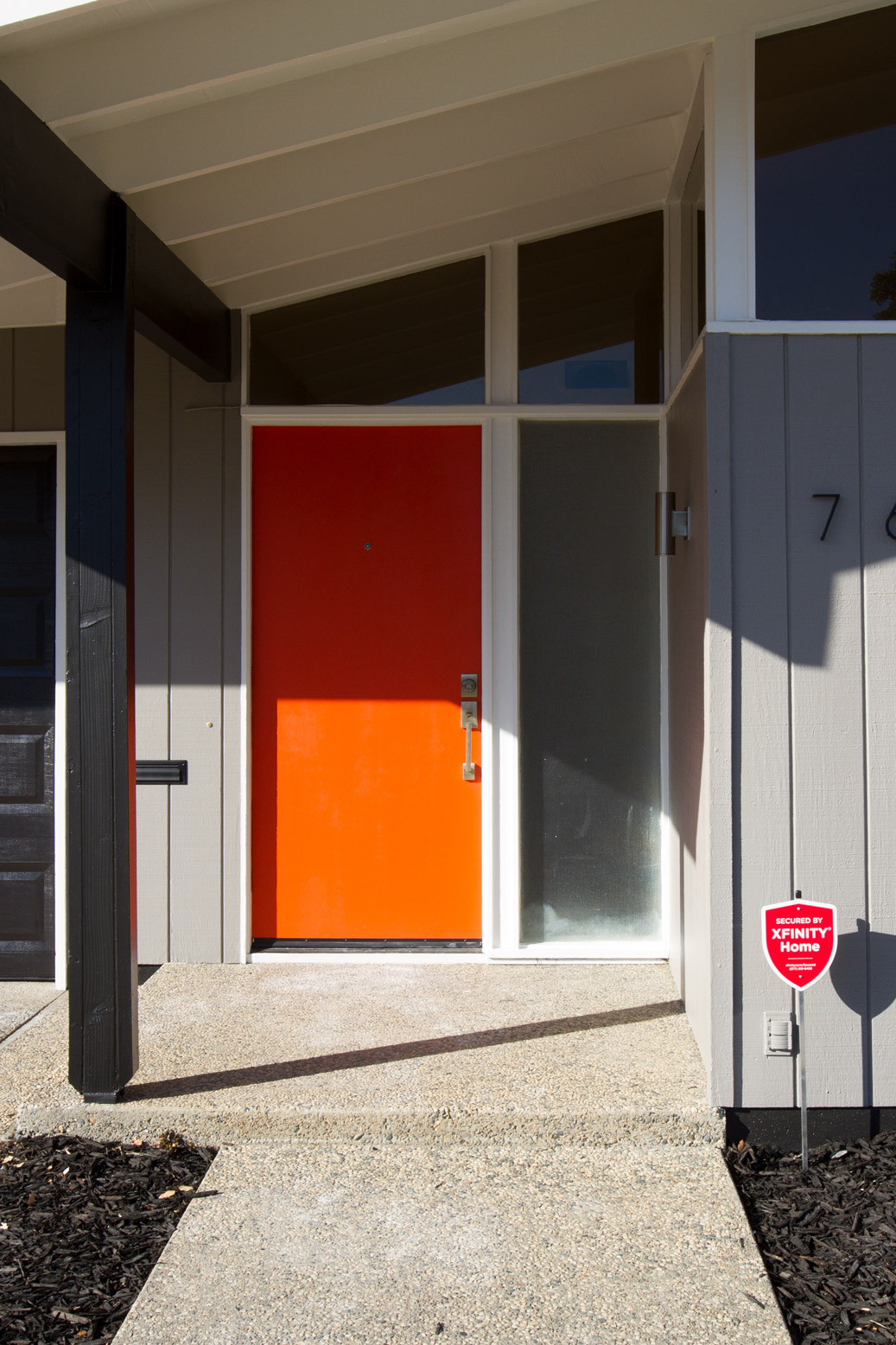
The original door color was a not-so-appealing muddy slate blue. I've always wanted a brightly colored door for a pop of drama and now was my chance -- a mid-mod house and no HOA rules! So, I chose one of the brightest and intense oranges I could find, Obstinate Orange. Just a warning though, if you use a super bright color like this, always paint a coat of white primer. I skipped it, and found out the hard way that these super bright colors tend to be very translucent and I ended up having to roll on 7 coats to get the pure color.
All together with the welcoming warmth of the gray and white and the drama of the orange and black highlighting the unique architecture, this house really shines!
