En Suite Dreams - Part 1
Since the inception of this blog in 2016, I have not featured my master bathroom. That changes today. The en suite is an important space in the footprint of my home, but it’s also been one of the last, and most challenging rooms I’ve decided to tackle.

Of the modifications that had been made to my home prior to purchase, the master bathroom was the one that had been more recently updated. Judging from the materials and finishes used, I would guess it was an early-2000s renovation. While it wasn’t to my personal preferences, it was a clean and updated space that I have been able to live with for several years.
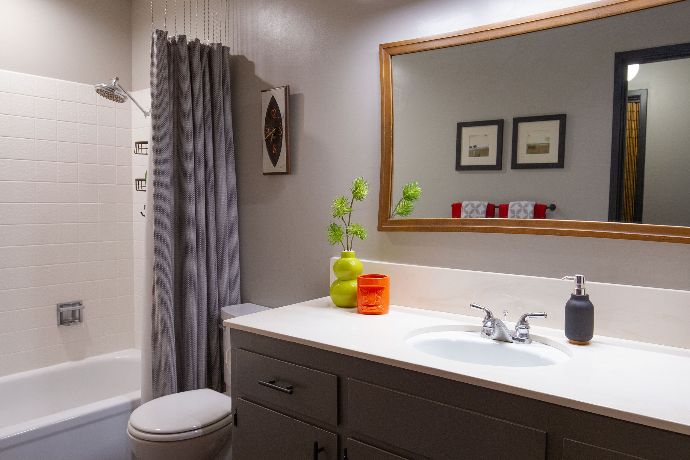
The Before
Bathrooms in mid-century era homes are often considered small, narrow spaces. A new build today would likely boast a bathroom twice the size — a very nice upgrade indeed. However, Streng Bros. Homes were designed with modest bathroom footprints, making for a more spacious master bedroom. I find this to be.a design feature that works well for me and the way I live. After all, no one is sleeping or having a cocktail party in the bathroom — at least not here. Luckily, the footprint of my master bath had not been changed as my intent was to keep all installations in their same location. A cool blue-gray palette, bright white, glass mosaic tiles, chrome, and contemporary fixtures filled this space. While bright and modern in its existing state, I envisioned something more moody with a vintage vibe that felt more connected to the work I had done on rest of the home.

Streng Bros. Homes, Plan 103 © 1977 Streng Bros. Homes, Inc. and Carter Sparks, Architect
Let Vintage Lead the Way
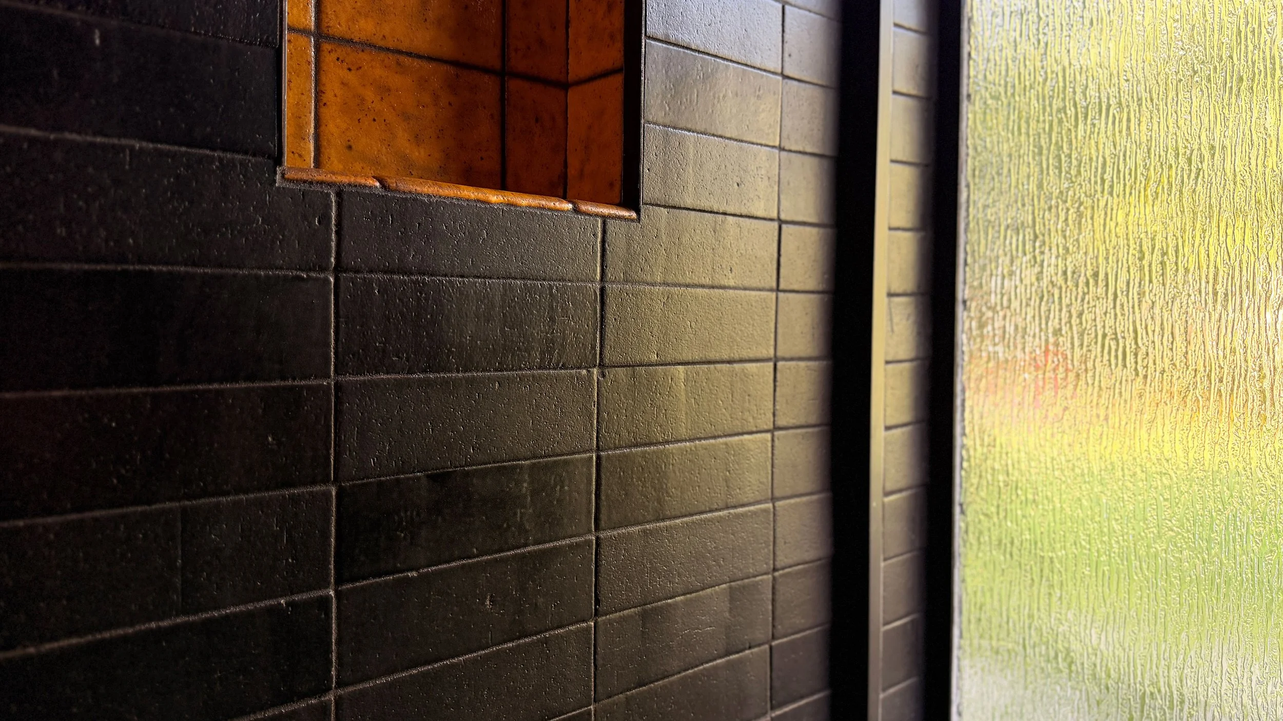
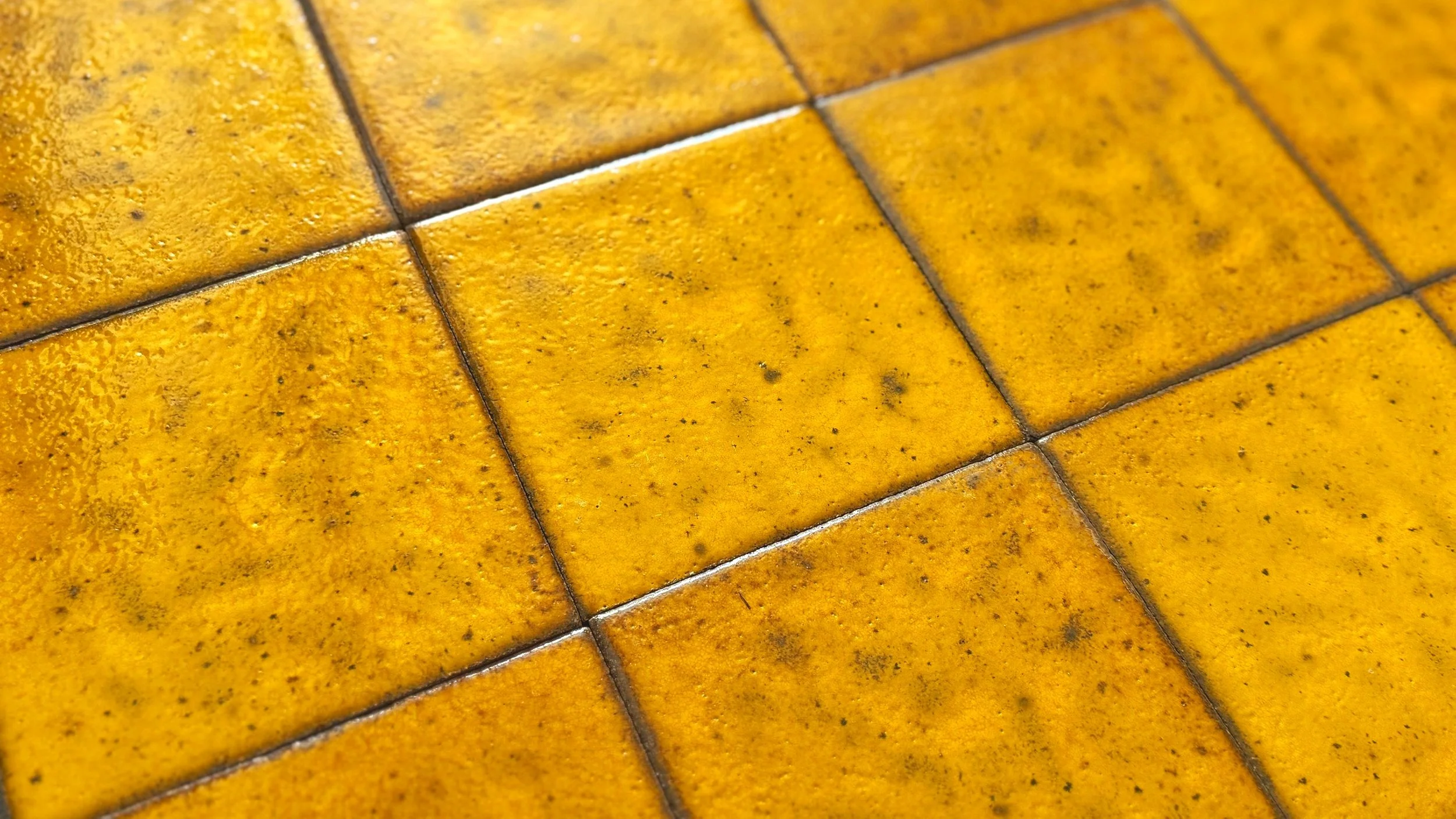
It was a collection of vintage tile that would be the inspiration for the bathroom color story. A seller on Instagram had posted a couple of storage totes of yellow 6”x6” tiles — about 80 pieces in total. The color was stunning, and I was really drawn to the variegated mustard tones and fine black speckling. From my guess, I figured they were likely pieces from the late-‘60s or early-‘70s. Upon further inspection, I was able to decipher a faint stamp on the back of the tiles, which read, “Stonelight Tile Co. San Jose, CA.”
The Stonelight Tile Co. dates back to 1920, and is one of the few California tile manufacturers of the era that is still in operation today. Their creations can be seen at celebrated buildings throughout California including Hearst Castle in San Simeon, InterContinental Mark Hopkins Hotel in San Francisco, and the California Fox Theater in San Jose to name a few.
I didn’t have an exact plan for the bathroom design when I acquired the tile, but I intended to make these stunning pieces the star. Just a couple days after purchasing, I was contacted by the owners of one my favorite local vintage shops. They saw the Instagram post, and wanted to let me know that they had more of this same tile in their warehouse. Of course, I darted over there to take a look. To my amazement, there were another 100 or so gorgeous Stonelight Tiles that were an exact match to what I had acquired. Loading up the haul into my car, I felt as though I was reuniting long lost friends. Some things are just meant to be.


Rough sketch of new master bathroom elements.
Drafting the Plan
For the overall style of the bathroom, I wanted to get away from the contemporary-luxe look by creating a space that felt more refined and appropriate to the home. A mix of mid-century and Japanese design styles are my preference, and this room would be no exception.
My vision for the design was a calming, spa-like retreat with vintage-modern and Asian influences. I assembled a black and yellow palette, which would be paired with American walnut cabinetry, ebonized wood, matte black hardware, aggregate concrete, clear and rain glass, black porcelain, faux grasscloth, and a few antique brass accents.
I chose Fireclay Tile’s thin brick in Black Hills for the majority of the walls and shower surround. The natural texture and lightly pitted surface are properties that mimic the architectural brick seen in the H.C. Muddox brick masonry — a signature focal point in most of Carter Sparks’ living room fireplace designs. With that in mind, I opted to arrange the 2.5”x8” bricks in a matching straight set pattern. I moved forward with calculating tile square footage and placing my order, but it was going to be a long road before I was ready to install.

Rip it Up
Being new to the bathroom remodel scene, I was admittedly a bit nervous about tearing this room apart. But as with many projects I’ve tackled, I forged ahead with the vision of a major upgrade in sight.
The exposed aggregate concrete floor in this room was finished at the same time as the rest of my home, so I put down a protective layer of floor covering during demolition.
Swinging the sledge hammer and busting up this space was pretty cathartic. I had been wanting to replace these materials for several years, and it was finally happening. The shower floor and curb tiles proved to be a beast to remove as both seemingly had excessive mortar applied.


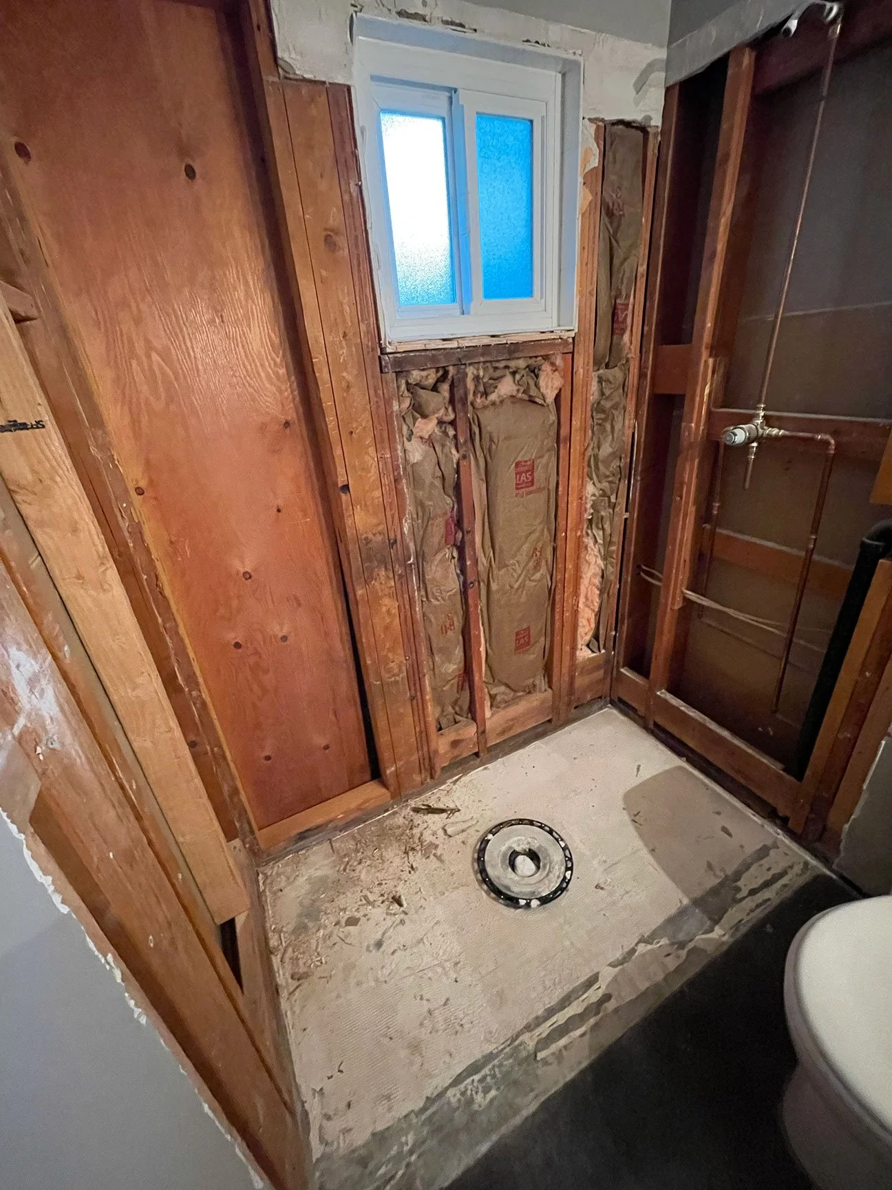
One of the biggest eyesores in the room was this overly chunky, white vinyl window in the shower. It let so little light in that it could barely be called a window in my opinion. The plan was to replace this window with a much larger 15”x70” custom made, black aluminum option that would be positioned to the left of the beam instead of the right. The lead time on this piece was several months, so we couldn’t begin framing for that piece just yet.
Over the course of a couple days of intense crowbar and hammer sessions, Glen and I got the shower enclosure down to the studs, cleaned up, and ready for the next phase of demo — the shower floor.
There are plenty more adventures and surprises ahead in this multi-part series as I tackle laying the groundwork for a walk-in shower floor, so stick around.